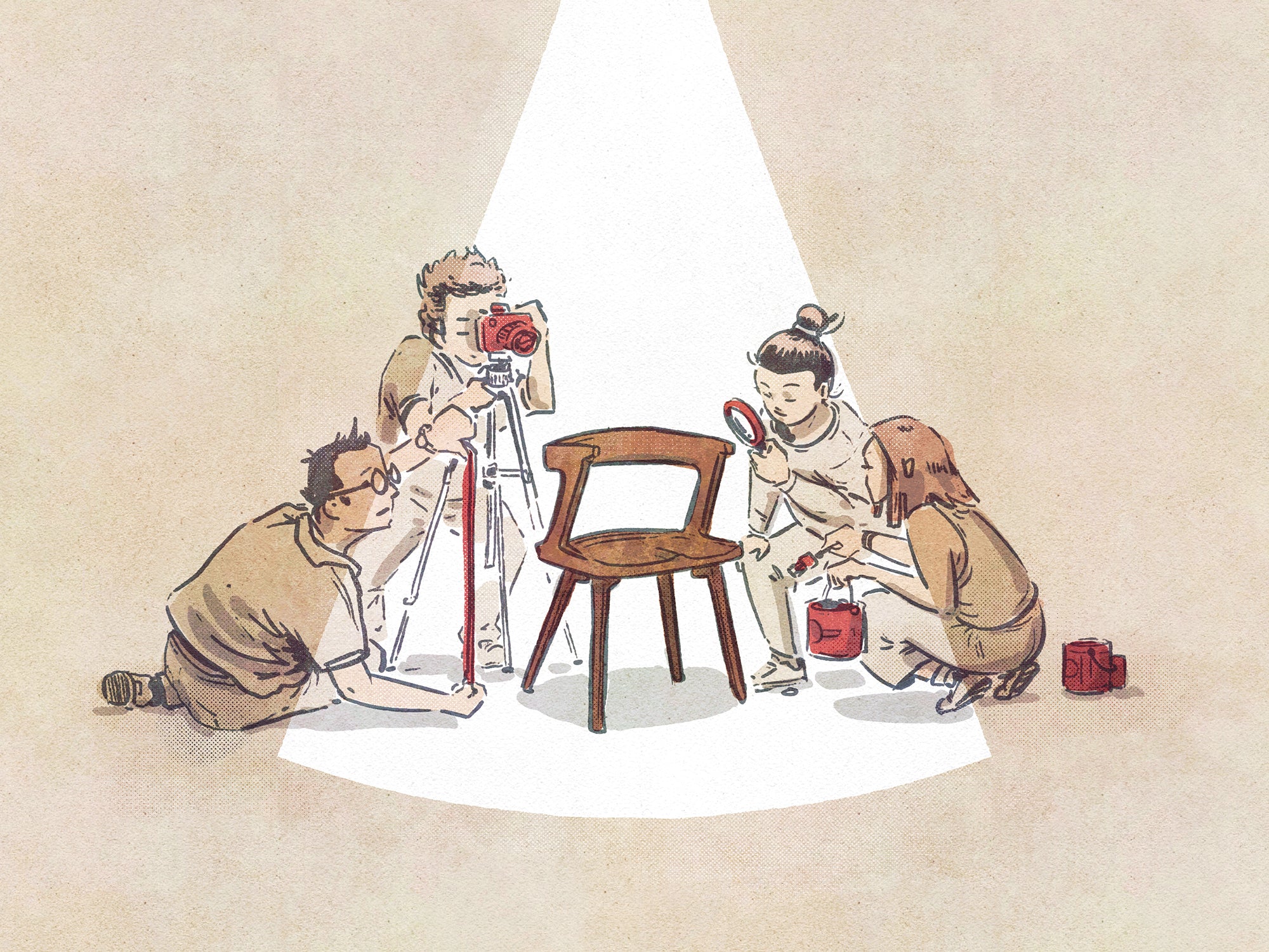
ELEMENTS OF GOOD DESIGN
Today I am going veer off subject as, at first, I was going to return to reminding you, my dear readers, for the millionth time, that buying well makes a difference. I say this despite knowing that, without a shadow of a doubt, only the intervention of governments expressing the will of most of their citizens will make any sort of impact upon the problem of climate change with the urgency that is necessary. But whilst researching a new take on this subject, namely where individual responsibility ends and collective responsibility begins, I ended up having to look at a lot of different furniture over a number of hours and I have to say my blood was boiling by the end of this process.
So that led me astray and to try to work out what it is that makes good furniture, in a way that is separate from taste or fashion. These things, in many ways, are personal and, frankly speaking, I have seen what I consider good taste amongst people furnishing with more traditional designs as well as ghastly taste amongst people furnishing in a more contemporary way. But this subject is one that is difficult to define well, and I can not hide that I have relied on instinct more than anything else.
But having thought about it, as I start the 25th year when furniture has been an inextricable part of my life, I think defining good furniture boils down to four elements. They are proportion, integrity, the use of colour and, finally, the role of decorative features. Each one of them can ruin the whole thing but, frankly speaking, many times all four of them show up on the same piece. I can think of enough things to comment on each element to merit a paragraph or two below.
We will start with proportion. Furniture needs to be proportional to people, not to rooms. The interest in furniture that is unusually large is hard for me to understand. If you are fortunate to have a very large room, perhaps you should consider more furniture rather than a few pieces of a beastly dimension. In the end, all furniture will need someone to use it, and I have always felt that a piece of furniture needs to look right with someone using it and should never dwarf them. The same could be said not just about the overall size but also any individual component. If an arm of a chair or a sofa is of a grossly exaggerated size, then please steer away because, although I do not want to bring anthropomorphic characteristics to furniture, it does, in a sense, reflect us as well as our postures and routines and nobody needs a huge arm to rest their own slender arm.
This still leaves us with another but far from negligible issue, the one of waste. If there is anything that should change sooner rather than later, it is our attitude to waste. And if you have just made, designed or bought a sofa that is twice the size of everything else, the thought that should cross your mind is: Why did that happen? What compelled you to use twice the resources to seat the same number of users? I can't call that creativity. So there are visual and aesthetic motives to abhor anything that is disproportionate, as well as what I think are legitimate concerns to do with the overconsumption of materials to achieve an objective.
The next element that I think is essential when it comes to evaluating furniture is what I call integrity. This word can apply to all kinds of features, from the build quality to how easy things are to put together, but I prefer to think about how the product explains itself to the world. In architecture, the word tectonics is used to express a set of complex thoughts, but one aspect that interests me is presenting construction as an art, and therefore explaining visually how the building comes together is treated as something important. Although perhaps we don’t need a concept as difficult to describe as this one in the world of furniture design, there is much to be said about what you see is what you get. And with that comes a strong distaste of anything that covers up, or disguises, or pretends it is something that it isn’t. In fact, I feel like saying there is something dishonest when this happens. Consider, for example, how most people in the world will use the word wood when they see something that has a thin sheet, often less than 1mm thick, on top of a material that has very little to do with their idea of what wood is. In fact, there is much to be said about consuming a material you understand well, rather than one that is a mystery to us all because human nature tends to overlook the consequences of all kinds of hidden processes and consequences that come knocking on our door later.
This brings us to colour. I have always been intrigued by how many people assume contemporary furniture has something to do with primary colours. And how primary colours continue to be rolled out to shock or surprise and, I assume, delight. I don’t have a problem with colour; there are many places for it from fashion to art. But I am intrigued why it must enter the home the way some people envision it. If the home is a refuge and furniture is there to serve us, then, frankly speaking, it is hard to talk about colour without thinking about nature. Recently, I moved to an apartment with a large terrace and, like many people this day and age, we threw ourselves at trying to soften the hard edges of our building with the help of plants. Not having thought much before about this, I am still a beginner trying to work out the names of things, watching plants grow with wonder, happy to see some birds and insects visit, and fighting a war with some vine weevils that look as nasty as they sound and have gobbled up a large part of a nice plant. But even a beginner, who looks out of his windows for the first time to see a lot of green, can marvel at how the many shades of green complement and work well with each other. And when the bolder colours appear, they are used judiciously and in most cases to serve a very specific and precisely defined function. I am not going to say that we have to live in nature, but landscapes offer us one lesson after the other when it comes to colour. Consider a business run by a gentleman I know who weaves beautiful textiles from a workshop nestled in the Mourne Mountains of Northern Ireland. The greys and browns of the landscape are comfortable and easy on the eye, the same way his peers, whom we have got to know better recently in the Alentejo region, draw upon the browns and clay colours that are so visible in the summer. That brings me back to furniture. Colour: use it judiciously.
Last but far from least, the purpose of decorative features. Minimalism is not, in my view, about reducing something to nothing or as close we can manage. Instead, it is about using the right amount of any material or feature, and nothing more. In a way, this brings us full circle to the issues brought up when I looked at the first point, where proportion was connected to wasteful behaviour. When it comes to decorative features, furniture has a long history of being part of the decorative arts and denying it is to aim for a joyless interior. Of course we aim for functionality but we also aim for things that bring us joy, or induce an emotional response, or just make us happy. Sometimes, the tactility of a material is more than enough, but there are elements in colour and textiles and finishes that play a role. But my rule of thumb has served me well, and every time I deviate from this, I tend to regret it: One is enough. One element, one material, one textile, something that delights the eye, is more than enough.
If anything binds these thoughts together it is the notion of frugality, efficiency, purpose, and a desire to reduce waste actually working together to create better products without necessarily ending up with something that looks like the set of 2001: A Space Odyssey.
That probably is enough for today. I will be back in the next essay to look at the subject that started all this, namely the desire to greenwash everything within sight and what that says about us all.
ILLUSTRATION BY RIMA STUDIO


